Building a brand that conveyed the promise of Syndicate's technology to the world.

Syndicate is a series-A crypto company that was founded to revolutionize venture capital—that is, how the future gets funded.
Since then, the company has pivoted to focus on delivering that same underlying tech in developer APIs that let anyone, including some of the internet's fastest-growing communities and culture-defining brands, build their community on crypto rails.
I joined Syndicate as employee #1. Less than 6 months later, we closed >$28M from VCs like a16z and scaled the company to over 30 people around the world. As Head of Design, I’m responsible for the core pillars of product design, research, brand, content, design ops, and a pillar we like to call “economies”, so called because we don’t just design our product—we’re designing entirely new economies and a fledgling industry.
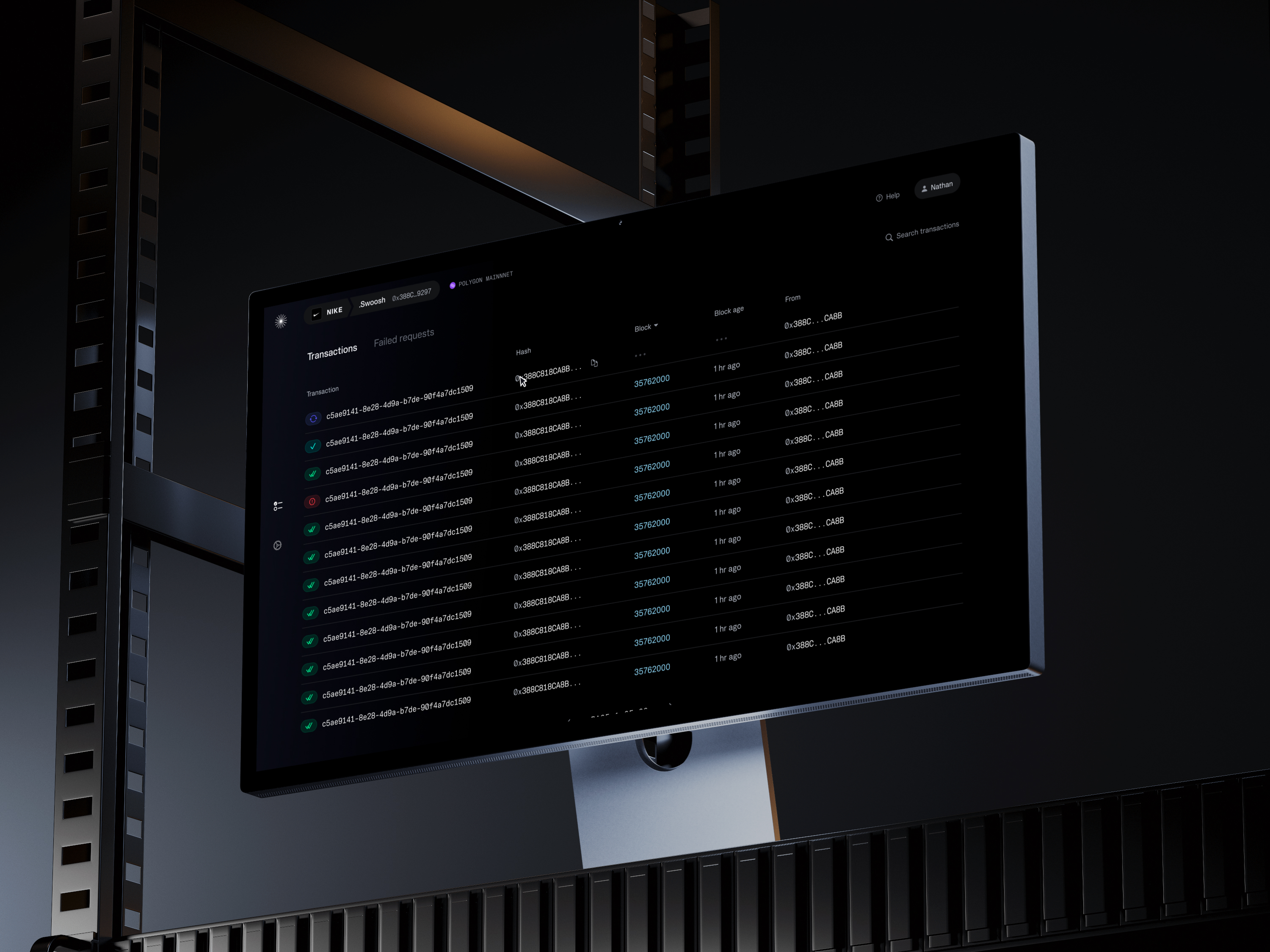
A quick note about financial case studies
The designs below are concepts that include placeholder, randomized data for illustrative purposes. Any similarity to real life events are purely coincidental. Nothing contained herein is or should be construed as investment advice, legal advice, solicitation or encouragement to conduct any financial transaction, advertising for any current or future offering of any token or security, or knowledge of a company's future token or security offering plans.
Syndicate's brand was grounded in sci-fi and the promise that crypto represented an evolution of humanity
We took inspiration from Lineto's Moonbase font in considering the relationship between spacetime—a plane of featureless dimensionality or matter—and the objects that existed within it, distinguished by their boundaries. When matter is shaped—its boundary defined—it's then that it takes on its own identity, complete with symbolic and metaphorical meaning. In LL Moonbase's example, those shapes are the letters, numbers, and symbols of a typeface. For us, this matter–object metaphor was a way to explore crypto's relationship to physical tangibility.

We realized that the nature of life was the development of complexity. From shapeless atomic matter, the structure of molecules and crystals form, and from there, cells and organisms, buildings and large structures. Development is related to complexity; more advanced, evolved organisms are more complex arrangements of their matter, with more specialized parts and abstraction.
This idea of complexity became a brand metaphor at the heart of the Syndicate brand. The internet was a primordial ooze—a spacetime field—from which Syndicate's tech allowed you to construct the cities of the future.

This brand positioning enabled us to use space and sci-fi as a metaphor for utopian human progress, and Syndicate as a tool to reach for the stars. We named our primary black and white brand colors Void and Starlight.
Our logo came to represent this aspiration, too. It’s a literal and figurative North Star (Polaris), waypoint, a guiding light.

This sci-fi brand story became the inspiration for a number of other brand elements, including color, which combined inspiration from finance and popular culture with sci-fi references like 2001: A Space Odyssey and wonders of cutting-edge modern technology like the otherworldly glow of Cherenkov radiation in a nuclear reactor.


Crypto as a utopia
As we built, we asked ourselves, “how might we visualize the emotion of the kind of radically new world Syndicate is trying to create?” Our brand lead at the time, Blake Johnston, led this work into exploring how our brand might visualize the almost-too-good-to-be-true utopia through a sort of surrealist imagery he titled Hype-®-Realism. Hype-®-Realism played with imagery of “liminal spaces”, delivering a feeling of dreamlike wonder at this invisible cyberspace world of radical liberation. A concept of utopia that's almost too good to be true.
While we ultimately didn’t end up using this direction visually, the exercise was a powerful push forward in how we thought about our brand.
Selections from brand moodboards
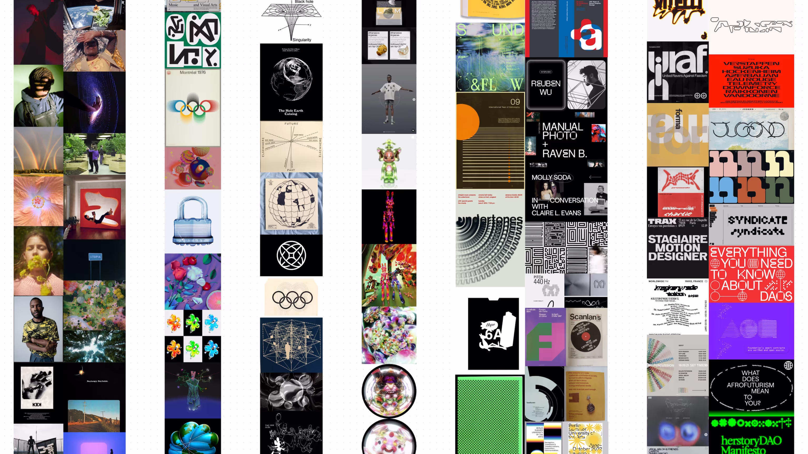
See more from our brand moodboards on our Are.na boards.