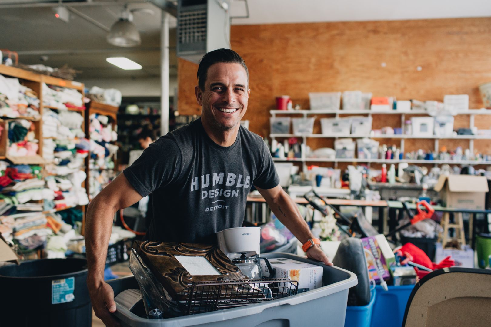
In the US, 50% of formerly unhoused people will again lose housing. Humble Design turns houses into homes, turning that 50% into 99% retention.
Good Measure, a new kind of nomadic agency that organizes creatives from across the country and the world to do good things in the world, like rebranding non-profits for free. Because we’re all working together intensively, what would normally take months is accomplished in a mad sprint of only 72 hours (with very little sleep).
Good Measure, a new kind of nomadic agency that organizes creatives from across the country and the world to do good things in the world, like rebranding non-profits for free. Because we’re all working together intensively, what would normally take months is accomplished in a mad sprint of only 72 hours (with very little sleep).
A quick note about financial case studies
The designs below are concepts that include placeholder, randomized data for illustrative purposes. Any similarity to real life events are purely coincidental. Nothing contained herein is or should be construed as investment advice, legal advice, solicitation or encouragement to conduct any financial transaction, advertising for any current or future offering of any token or security, or knowledge of a company's future token or security offering plans.

Every night in America, over half a million people are homeless.
It’s an outrage.
And that doesn’t take into account the many people who may have a home, but very little inside it. Furniture, decoration, and lighting, may seem like relative luxuries compared to sleeping outside, but data and the experience of dedicated social workers and researchers—not to mention the people living in such conditions—tell us these so-called “little things” are, in fact, hardly little at all. On the contrary, they’re hugely impactful in making a house a home.
And in keeping residents in their homes; research shows that when a house feels like a home, recently unhoused people are far more likely to remain it it. That’s Humble Design’s mission—to turn these empty houses into homes, inspiring hope in those recently transitioning from homelessness.

The service Humble Design provides makes a huge difference:

How it works
Humble Design is led by Treger & Rob Strasberg and a small core team, but powered by a team of community volunteers
It all starts with interviews, connecting recently homeless families with the possibilities for their new home.
Then, a team of community volunteers hand-selects items from the warehouse to design the family’s new home, tailor-made to the family members’ unique personalities and interests. Volunteers even make new items from scratch, like custom wall decorations featuring children’s names.
Next it’s time to put everything in place: movers bring in the heavy furniture, while volunteers bring in the smaller items. It all culminates in a reveal, showing the family their new home.


Content Strategy
Humble’s identity is about stories—of a family’s fresh start and a community coming together. So our content strategy put this incredible asset front and center, in words, photography, and video.
Social media, advertising, and the website focus on this combination of type and image, often using shapes from the logo to inspire layout. Copy is abstract, leveraging emotion by featuring simple taglines that convey the Humble Design mission and impact.

Logo + Wordmark
Humble Design’s work is all about welcoming people into homes designed just for them. So it makes sense that the logo focuses on a house—the starting point for that new beginning.
And of course, the lowercase “h” echos the name, Humble Design.
Social media, advertising, and the website focus on this combination of type and image, often using shapes from the logo to inspire layout. Copy is abstract, leveraging emotion by featuring simple taglines that convey the Humble Design mission and impact.

Appropriately for a company called “Humble Design”, the sans-serif, lowercase logotype is understated, minimal, and modern.
It also lets the other, storytelling-focused elements like headline type and imagery take center stage.

Typography
Nothing shows the brand talking better than type. The type system is straightforward and adaptable, while conveying a distinct personality of humanistic warmth and passionate care.
A myriad of influences from the mood boards had an impact here. The header type hints at and almost reclaims a graphic language too often co-opted by luxury lifestyle brands. Here, the 70s-esque serif, Recoleta, shines as a humanistic graphic statement that embraces the client’s focus on unapologetically expressive design, while remaining warm and accessible. It can also be flexible when needed: though we keep it at a Regular weight to avoid hitting the soft Cooper feel too hard, six other weights exist too, and glyph alternates include a single-story “a” for smaller applications.
For body copy, Proxima Nova does the heavy lifting as the brand system’s flexible workhorse, and because it’s a free Google Font, it’s easy for the client to use it anywhere across their nationally-distributed and largely volunteer team.