Led design for an operating system for the built environment, unifying Proxy's environmental tech and the people who occupy those spaces.

Proxy was a series-B startup building technology that made our built environment magical, from doors automatically unlocking as you approach to a room's temperature customizing to your preferences when you enter. Proxy tech combined advanced sensing, environmental control hardware (door locks, etc.), and a suite of software that powered Proxy's domain awareness system.
The work we did set Proxy up for an acquisition by Oura in spring 2023.
I joined Proxy as the second software product designer, partnering closely with the CEO to redesign our suite of apps and explore new R&D initiatives.
A quick note about financial case studies
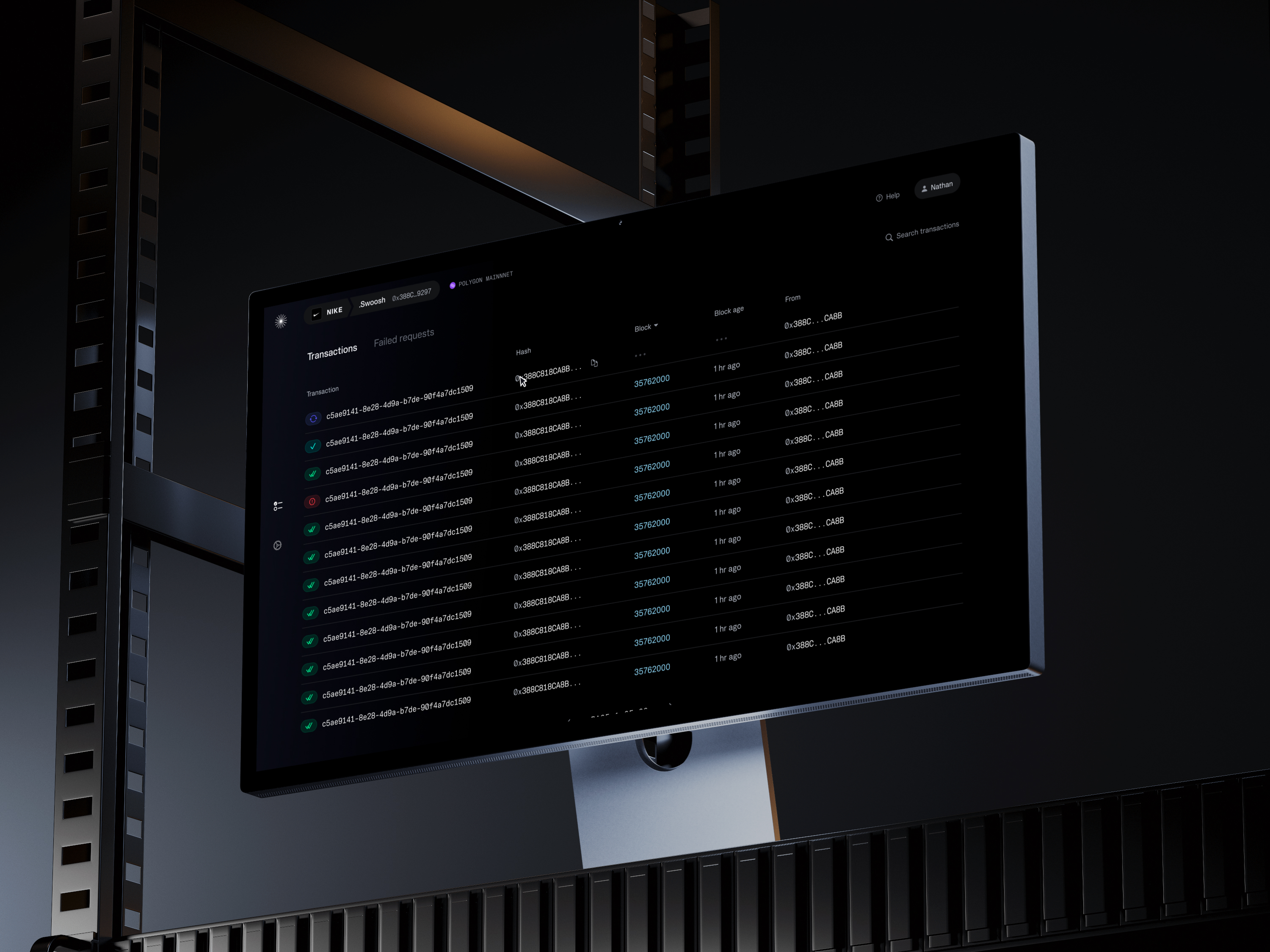
The designs below are concepts that include placeholder, randomized data for illustrative purposes. Any similarity to real life events are purely coincidental. Nothing contained herein is or should be construed as investment advice, legal advice, solicitation or encouragement to conduct any financial transaction, advertising for any current or future offering of any token or security, or knowledge of a company's future token or security offering plans.

Axis 2: Use cases and services
What kinds of things can Proxy help me with?

Axis 3: Domains (aka “spheres”)
The Proxy experience is highly contextual. The app has always unlocked doors when you’re next to a reader, but what if it could do more than that? We developed this system of domains to map how the app might change across different scales of awareness, from face-to-face interactions to exploring the whole building and local area.


The new Proxy app, broadcasting the Proxy signal, does so much more than unlock doors. Let’s follow Lisa through a day powered by Proxy:
After COVID, Lisa’s company gave up a permanent office. Instead, she now works with her coworkers from a co-working space on some days. With the Proxy app, she can book desks, check-in, log her health status, unlock doors, and much more with her Proxy signal from her phone. No extra stuff needed.

Today, she’ll need a desk. So, she reserves one in a few taps:
Mid-fidelity conceptual designs—not quite pixel-perfect, some inconsistency here, but conveys the concept

When she arrives, it’s a few taps to complete a simple COVID health screening
Work on this interaction was led by my partner in design crime, Ian Jaye.

When Lisa arrives at her co-working office, she’s prompted to check in. We designed a flexible, admin-configurable experience for a variety of location use cases (whole-office-building management, multi-company office building, co-working space, etc.) and user types (visitor, co-working member, regular workspace member, and admin roles).
Here, the gradient at the bottom offers a visual indication that this is a Proxy Signal-enabled place. When a user approaches, their Proxy app (if they have one) becomes entangled with the kiosk, changing the gradient on both devices.
Read more about how this gradient works in another case study, here

We developed a system of iconography to convey what were, at the time, very poorly understood degrees of health and immunity from COVID-19.

With vaccination rates still near zero and infection rates high back then, we had to rely on self-reported health screening questionnaires. Users could complete these daily to receive a certain pass level.


Back to Lisa’s day. No extra pass or check-in is required, since the building already recognizes her from her Proxy signal. She just walks right in—doors unlock automatically as she approaches.

In many cases, Lisa won’t have to take her phone out of her bag all day. It all happens without any interaction. That’s why there’s really no UI to show in this section.
It’s rare to have an app that works this way. We’re taught that tech products should optimize for clicks and taps, eyeballs-on-screen, engagement. In this case, we may be most successful with the minimum amount of screen interface as possible. The user’s presence is often enough, and we can close the feedback loop with them through changing the light color on the reader, sounds, and phone and watch haptics they can feel without looking. And of course, the door opening automatically, as if by magic.
Then, at lunchtime, she orders directly through the Proxy app for delivery to the office’s Proxy pickup station

At the end of the day, Lisa heads home. Today, that’s where the Proxy story ends. But in the future, maybe her bus pass, drivers license, or any number of other things will be part of Proxy, too.
This end-to-end design was, in many ways, 0 to 1. Although there was an existing product and design system, it was a redesign from scratch, starting from product strategy.
The outcome, to our users, our team, and our business, was huge. We shipped product for the first time in two years and reinvented how our product, team, and even company worked. We built a much stronger process for how we make product and design decisions and a much stronger foundation for future product development.
.avif)


