In 1978, the legendary designer Massimo Vignelli debated cartographer John Tauranac at Cooper Union. The subject? What design of subway map—and really, what philosophy of wayfinding design—would best serve the millions of people each year who ride the New York City subway system?

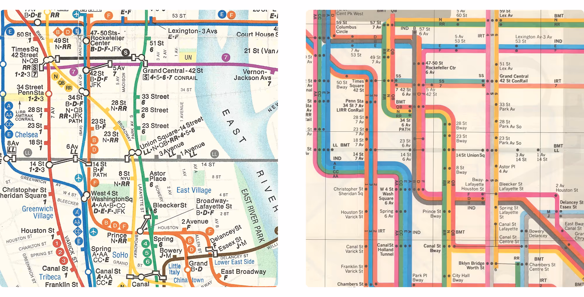
Vignelli, a designer, argued in favor of a geometrically abstracted map: easily readable but inherently less geographically accurate. It bought readability for riders at the expense of accurate representations of distances between stations, an issue especially relevant if you intended to walk between them.
Tauranac, a cartographer, said that maps should follow geographic realities and that, (paraphrasing here) anything else is a lie. This was the first NYC subway map war.
This debate was captured in this great book by Gary Hustwit, the filmmaker who brought us such design pillars as Helvetica and Rams.
..avif)

Tauranac kinda won that fight (after a brief period of Vignelli winning out), since this has been the subway map for some time now:

But now, the second great map war has arrived. Quietly, during the pandemic, when almost nobody was riding the subways, the MTA rolled out a new pilot program featuring a new map inspired by Vignelli's design:

This is displayed across the system, having started with a few stations, alongside a refresh of the old, more-geograpically-accurate Tauranac-school design. As Gizmodo reports, the situation is tense:
The MTA’s chief customer officer Sarah Meyer told the Wall Street Journal that she’s trying to “introduce this map in a way that doesn’t cause fear, introducing it gradually so people can get used to it.” Fear sounds like a wild reaction to a map, but redesigning the subway map is an explosive advancement in what’s become known as the map wars.
Choose your fighter.


